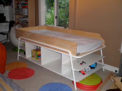
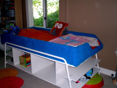
jess c. from maine takes the morrum bed and makes it kid friendly.
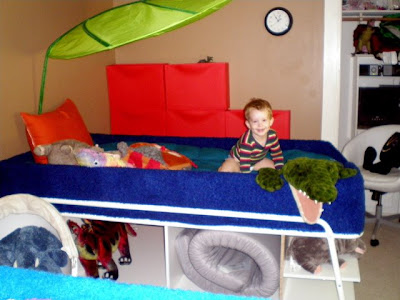
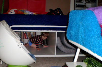
she says, "i was drawn to the morrum beds for my kids (5 & 2) as we live in a tiny house and need any additional storage we can find... particularly in their shared bedroom. however, the high bed wasn't ideal for a toddler... even though his climbing skills are superb, when sleeping i feared my son would roll off. i needed a way to make the beds 'cozier'.
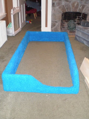
so i built a frame from 10 inch boards and 'L' brackets, left a little wiggle room for adding some foam padding and fabric and cut out a little notch at the end of the frame for climbing aboard. i chose a super fuzzy 'faux muppet fur' fabric (i think they called it 'poodle fleece') from a clearance aisle of a fabric shop used a staple gun to attach it over the padding.
we also left off the cabinet doors on the storage portion of the bed in order to more safely accommodate our kids using them as tunnels (no pinched fingers!), and also to give us a handy cubby for extra mattress storage (for sleep-overs, etc). the kids love the beds, and on those late nights/early mornings when our two-year-old wants us to lie down with him for a bit, we love how the frame keeps the big clunky adults from falling overboard too! this was my first ikea hack... i get the feeling it might be addictive?"
Monday 31 March 2008
Friday 28 March 2008
a living room makeover pt. II
denise sent me some additional pictures after the rave reviews on her boyfriend's pad's makeover.
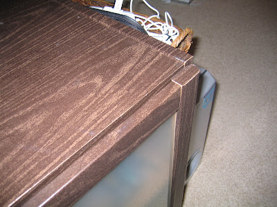
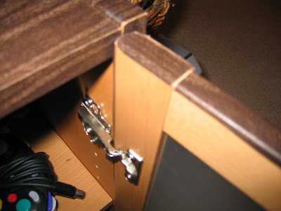
she adds, "basically, we didn't want to buy furniture since the green way is not to consume more. staining the furniture was not an option since ikea uses laminate. i came up with the idea after looking at my parent's pantry. they used contact paper to line the shelves. i knew they made contact paper in a walnut finish which was the effect we wanted (we both adore walnut finishes).
the contact paper has a low stick backing and we just applied it to the surface. it's a two man job and while one of us held it in place, the other would use a dry marker eraser to smooth out the bubbles as we went. we had to use a very sharp blade to cut around edges and corners. in one of the photos you can see the original finish with the contact paper coming up and over the edge. we didn't do the insides since no one will see it anyways.
it is a great way to give ikea furniture a face lift without doing a lot of damage, mess or hard work!
i also included some 'before' pictures.
total spent on the room was: $1500."
make a cheap bar table
andrew finds a billsta bar table base in the as-is section for $8 and matches it with a lack side table. looks good and costs less than $25.
see more of andrew's billsta-lack bar table.
Tuesday 25 March 2008
lamps from thermo flasks? no kidding,
here's a new one from kai of kairichter.com. (link updated 1 april 08) thermo-flask lamps, are they hot or not?
he writes, "i wanted to have a kitchen light which transports something of the context. it works also on the table in your office or in your living room. all you need is a lampshade, lamp holder, a cable, a cable-switch and a bulb. to remove the glass-volume from the flask, you just have to unscrew the bottom of the body in left direction, then you can pull the glass-volume out. that's it."
unfortunately, ikea doesn't sell this flask anymore.
Monday 24 March 2008
a living room makeover
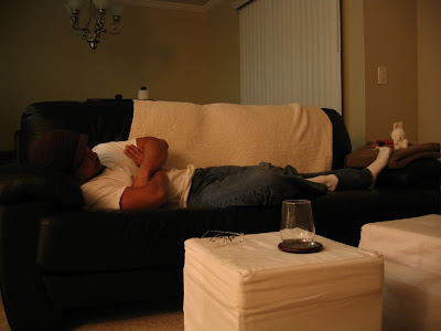
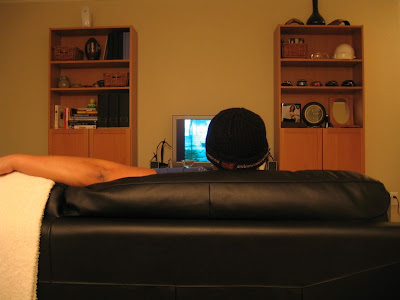
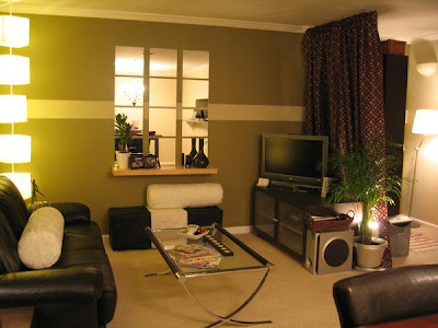
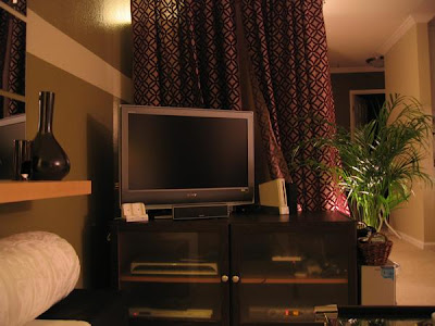
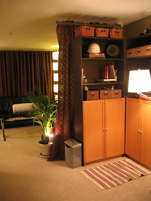
some eye candy to start off the week. this cool pad once looked like a dorm room. thanks to denise, the girlfriend, the place is completely made over.
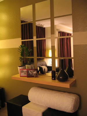
"for my boyfriend's birthday, while he was away for about a week, my friends and i made over his place. it used to look like a college dorm but is now a chic looking bachelor's pad. i wish i had pictures of the before but i wanted to start ASAP and forgot! me and my friends are students at the Art Institute of San Francisco. studying interior design! no wonder, huh? he was very surprised and thrilled. he still has a hard time believing it's his place.
everything was from ikea except the couch, curtains, and coffee table. i didn't want to buy any new furniture because it wasn't economical or green so we had to be clever. he already had the furniture but it wasn't in the finish he wanted, so i used walnut woodgrain contact paper (the kind you cover pantry shelves with) to cover them. it was a bit tricky to use and to make sure it was cut properly, we used a very sharp blade. i bought about 20 rolls of the stuff and we used every single piece - on the side tables, media bench, book shelves.
to create visual interest, an accent wall and focal point was made. he has no fireplace and no lighting (except for the dining room light). all the light fixtures are fluorescent.
we used a curtain hung from the ceiling with anchor brackets to section off a reading area and the living room. all of the accessories were found from the 'as-is' department. with a little careful space planning, this was our result.
here is a link to more photos (but you'll need to log-in to myspace to view them)
Friday 21 March 2008
wardrobe to computer workstation
john was in need of a nice computer wardrobe, and was very frustrated that all the solutions were either too small and shoddy or way too expensive. after some inspiration from this site, he hacks the leksvik 3 door wardrobe into a computer workstation.
he says, "i permanently mounted the main bay shelf at approx 30 inch height and placed horizontal supports under it to give it good support to hold the monitor and be the main work area. i then mounted an adjustable keyboard tray to finish off the main bay.
the smaller bay had 4 shelves in it. i wanted this bay for peripherals, and wanted pull out shelves for easy access. this was accomplished by installing 3 of the shelves permanently with drawer slides i purchased at a local home improvement big box. i ripped the 3 shelves down 2 inches in width, saving 1" of the width rip for an offset that i mounted to the rightmost side of the wardrobe, and then mounted the drawer slides to that offset which allowed the sliding shelves to clear the doors when they are open.
i used a hole saw to cut 1.5"d holes behind each peripheral shelf, and two in the main bay, one above the work surface and one below it. i cabled in power and USB to each peripheral shelf and was ready to go.
all told the cost was about $70 in random hardware including the keyboard tray for the mod. assembly was a snap. the main unit took about an hour to set up, and the mods took about another 2-3.
i ran into some difficulty with the slide offsets splitting from the wood screws. the reclaimed pine is very sensitive, and i found that countersinking for the screw head is mandatory and solves the splitting problem. tools i used were my trusty dewalt cordless screwdriver, table saw for ripping the shelves down, and a miter saw for cross cutting the the main work shelf supports.
this could all be done with just a manual screwdriver and a hand or hand power saw, but be sure to take appropriate measures to minimize chipout of the shelves if you do."
Thursday 20 March 2008
elvis is in the house!
some time back i featured this comic art stool. erin sends me her version - of the king, no less - on the stefan chair. the chairs are done by erin's husband, artist adam sorensen based in los angeles, ca.
she says, "we couldn't stand our boring stefan chairs any longer so my husband decided to decoupage them with images of elvis presley and horror comic books. each chair took days to create."
Wednesday 19 March 2008
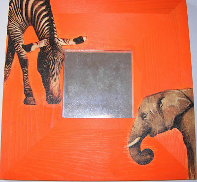
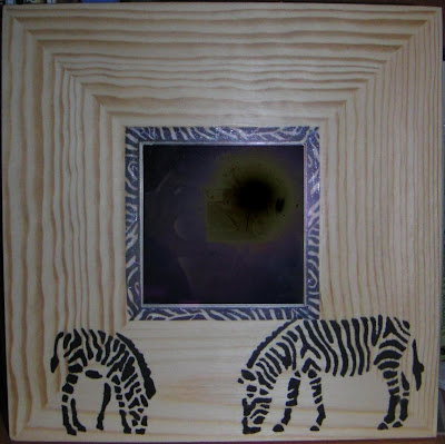
malma magic
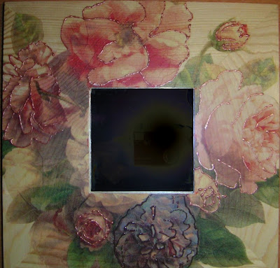
kathrin does a beautiful collection of malma mirrors using the napkin technique and stenciling. great idea for a gift.
[added 27 May 2008]
malma with hooks
concha from spain weaves her magic too with the malma.
[added 27 May 2008]
malma with hooks
concha from spain weaves her magic too with the malma.
Tuesday 18 March 2008
a vattern tv and entertainment unit
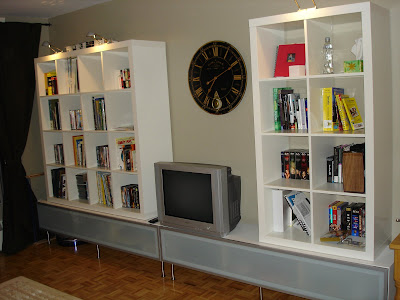
martin does a fabulous job hacking this tv and media cabinet from the vattern bathroom range.
"my original concept was to create an integrated book shelf and tv entertainment unit. i wanted a more modern bookshelf, that could hold lots of books, dvds, and decorations while hiding most of the av equipement associated with entertainment units.
ikea offers a tv bench called friel, but was too expensive for my budget. instead, i opted to use a standard vattern high bathroom cabinet and placed it on its side. i mounted six 6" legs to elevate the cabinet, and added two vertical shelves inside for support and stability.
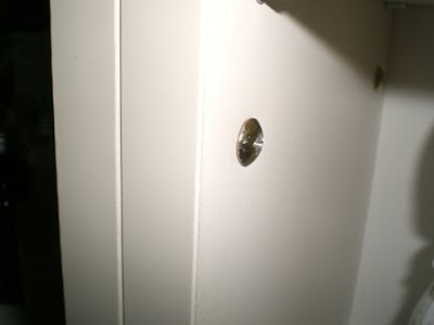
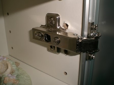
i used an ommen glass door front with three standard hinges and two soft opening arms. one of the bonus features of using a frosted glass door front is that infared signals from dvd and receiver remote works through the glass. since i had a large wall to cover, i used two vattern cabinets, which provided a very sleek horizontal look and not to mention, more storage space. i then added two expedit bookcases to provide the storage for books and decorations. i still plan to get baskets to hold the dvds and obviously purchase a 42" LCD HDTV."
Monday 17 March 2008
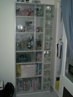
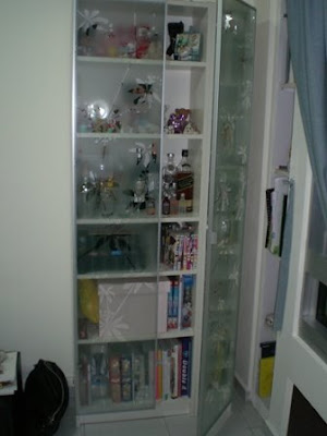
how to add doors to a skinny billy
here's one from yong kang of singapore who found a way to plump up a skinny billy and add doors.
"i had a 60cm (approx 2') wide billy bookcase for quite sometime (they don't sell the 60cm version anymore over here at ikea singapore).
when i first caught sight of the billy nyckelby, i told myself i really have to put that on my bookcase.
the problem is that the width of the doors is 40cm (approx 16"). then, an idea struck me, i could attach a benno cd tower (20 cm wide, approx 8") next to it to make up the total width of 80cm.
so i purchased the benno cd tower. new screws were attached for added stability.
then another problem came, the holes in which the door bracket is to be attached to the billy bookcase is different from the benno cd tower. new holes were drilled so that i could attach the door.
once these problems were solved, the doors were safely attached.
Thursday 13 March 2008
hackeas: the tiniest hack ever and more
a tiny sugar shaker
lauren uses the grundtal container with a magnetic back as a sugar shaker. just drill a small hole on the cover and keep it on the fridge.
link to lauren's sugar dispenser.
trones clothes hamper
sandrine repurposed the trones shoe storage as a clothes hamper, all properly labelled - "white", "black", "color" and "delicate".
space for inspiration
jenni found a super solution to the problem of wanting a wall-sized inspiration/bulletin board without having to put large and multiple holes in the wall. the hultet curtain/room divider is lightweight and hangs from the crown molding in her craft room. she says, "i tapped my entire supply of clothes pins getting the 'board' started, but i know it will hold hundreds more images and photos."
see jenni's inspiration board on her blog
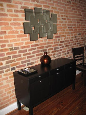
mirror art
willie and nicola saw a combination of square mirrors at Pads a furniture store in baltimore for $180 and decided to hack their own.
they say, "we decided to use the sorli 4 pack of mirrors. we laid the mirrors in the pattern we wanted and used a combination of gorilla glue and crazy glue to stick the mirrors together. we let it sit overnight and glued (gorilla glue) 2 pieces of 1'x1' pieces of wood to the back to use for mounting."
Wednesday 12 March 2008
suddenly it's not junk
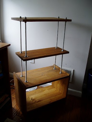
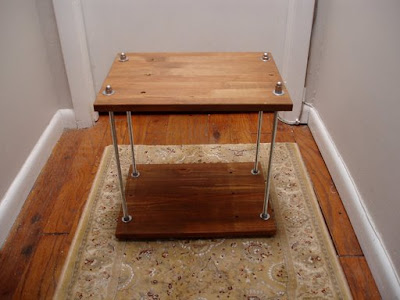
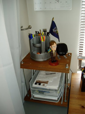
seth tried standing on a rast bedside table (bad move! don't do it) and broke it. he salvaged the parts into what he calls a FrankenRast and FrankenRast Jr.
he says, "soon after said implied mishap, i bought new (and larger) computer speakers, and wanted to use more of the vertical space in my office. i had an existing, still-intact rast already in-use for my printer. from all this, and a sudden abundance of pine boards, the FrankenRast (pronounced Fraaahn-ken-rast) was born.
i took the broken remains of a rast and sanded them up and stained where the damage exposed the wood's natural color (loosely speaking). i cut down 3/8" diameter threaded rods to 2' long, and drilled aligned holes in the existing and recovered rast shelves. i then used washers and nuts to slap the whole thing together. it's rather sturdy, looks pretty sweet, and was easily adjusted to get it level.
FrankenRast Jr. was borne of the remaining 2 pieces of recovered wood, the excess threaded rods, and more washers and nuts.
click to view more pictures of seth's shelving units.
Subscribe to:
Posts (Atom)